Tuesday 29 March 2011

Project: Research Creativity

That's what I found in Internet as a part of my research:
  • Research Project - Creativity
    Student Project - SSU
    (Autumn 2009 / Spring 2010)
  • The research project is an attempt to give some insight into how creativity works.The first section of the book takes on some definition and functions of creativity, before the book divides into three mini books:

    - "The sketchbook" contains short Interviews with 10 creative professionalsfrom different trades, showcasing 
       some of their work and sharing their thoughton creativity (and their thoughts on coffee as a creative fuel)
    - "The Case study" contains a journal and timeline that documents the creativeprocess of me and a
       friend during the D&AD project.
    - "The creative guide" wraps it all up by summarizing the creative techniquesthat occurs most in the
       interviews and the case study.


Monday 28 March 2011

Book Design : 3 Minutes

Just for inspiration:
"3 Minutes is the second publication from non-profit organisation Designers Against Human Rights Abuse (DAHRA) and the second collaboration between DAHRA and Tibet Relief Fund.

The premise of the book is to show the full extent of the Tibetan conflict through 10 diverse and extremely powerful 3-minute interviews, each describing the 3 minutes that changed their lives. This idea is reflected in the covers of each booklet, which separately make beautiful abstract covers but together form to make a ‘3’.

Contributors were asked to translate these minute interviews into 16 printed page booklets using primarily typography. The result is a book made up of 10 beautifully designed booklets from some of the world's best designers showcasing considered and stunning typography."
  •  
 

Sunday 27 March 2011

Seeing London through the eyes of a designer

Guys, this is exact project, we are doing now, done by some of the LCC students before. Wish you will find it useful.

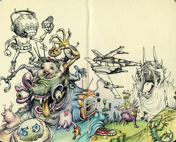
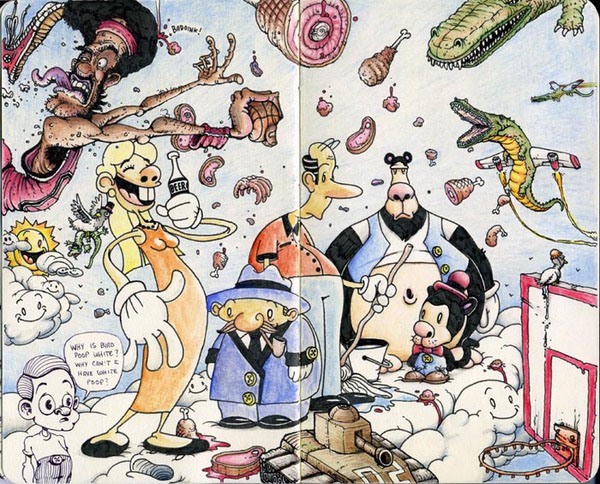
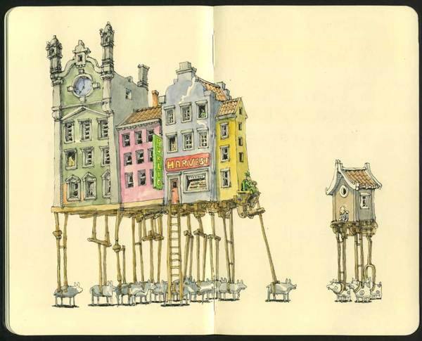
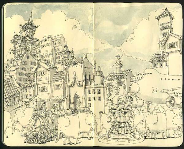
sketchbook scans of different artists

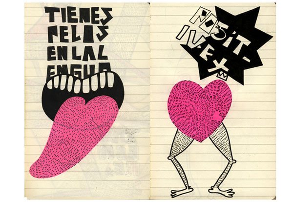
We all have different sketchbooks, it's different formats : A4, A3, A5 and so on. We have our thoughts in them, ideas, drawings. SO, check out scans of different artists' sketchbooks:


Allen Sutton


Mattias Adolfsson


Laura More Amore


Wednesday 23 March 2011

Composition: Dual Formats

Well, yesterday we had our first 2 workshops. One of them was a dual formats with Paul. We were talking about different types of dust jackets that will be a folded poster for our research book. These are some examples of what had been done during the lesson:


Tuesday 22 March 2011

"Diary of a very special love" by Patric Sandri

Our FMP project started. we have to make a research book about London. I will discuss it deeply in the future. That's what I found on Behance, as a great inspiration for me. Of course it is not that posh, printed glossy book, however it looks interesting.All works made by Patric Sandri from Switzerland.
  • 'Crime Time' by Igor Duibanov ( Russian Criminal Tattoo)

    228 is the famous paragraph of The Russian Criminal Code (the prime source of Law of the Russia concerning criminal offences). 228 is about illegal asquisition, storage, transportation, manufacturing, processing of narcotic drugs, psychotropic substances or their analogues.
      Paragraph 209 is about banditry, gang creation, gang membership
      Chain Reactions. Mutual Business. Partners in Crime.

    Monday 21 March 2011

    Periodic Table of Typefaces

    This table made by Cam Wilde. I found it on Behance, however now it is quite popular in the internet. The Table of Typefaces groups by families and classes of typefaces:  sans-serif, serif, script, black letter, glyphic, display, grotesque, realist, didone, garalde, geometric, humanist, slab-serif and mixed.  Each cell of the table lists the typeface and a one or two character "symbol" (made up by me simply based on logic), the designer, year designed and a ranking of 1 through 100.
    click to view full size

    Tuesday 15 March 2011

    My useless ICA project

    Here is my final presentation. Maybe I just should change my brain to be good enough for even 60 %?

    Matt W. Moore


    Matt W. Moore is the founder of MWM Graphics, a Design and Illustration Studio based in Portland, Maine. Matt works across disciplines, from colorful digital illustrations in his signature “Vectorfunk” style, to freeform canvas paintings, and massive murals. He exhibits his artwork in galleries all around the world and collaborates with clients in all sectors. Matt is also Co-Founder & Designer for Glyph Cue Clothing.
     I am really impressed by his works. They are really creative and beautifully done!


    Sunday 13 March 2011

    Friday 11 March 2011

    ICA research presentation

    So, time is going. We are going to hand in our ICA project on Monday. I am going to work all weekends, however I am almost finished it. Iam only have to go to ICA to make some photos for my final outcome. And that's it. But...There will be a new project. Final Major one. oh...I think I am gonna die of this amount of work:( I've been thinking about finishing all PDFs on my vacations. However it seems like I will have no time for it. God.

    Anyway. Here is my presentation.


    Tuesday 8 March 2011

    Know your type: Myriad

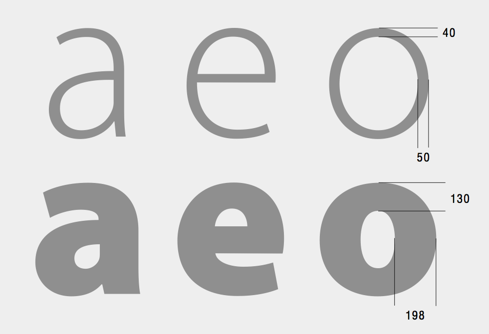
    Myriad drawings, showing the stroke weight ratio between light and bold weights (Source: Designing Multiple Master Typefaces, published by Adobe).

    Myriad drawings, showing the stroke weight ratio between light and bold weights (Source: Designing Multiple Master Typefaces, published by Adobe).

    Flat. Generic. Invisible. Myriad is the ninth installment in our ‘Know your type’ series

    In the early nineties, when typeface designers Robert Slimbach and Carol Twombly set out to design a new sans-serif for Adobe, the goal was to create something generic—jokingly calling the typeface ‘Generica’ during its design. “We wanted to make almost a totally invisible type of letter, just very generic… something that really didn’t show anyone’s personality too much,” explains Slimbach in Adobe Magazine.

    Friday 4 March 2011

    Guiness Timeline

    New task for VCT. Create a time line of anything, connected to Graphic Design. I decided to take Guiness Posters. Everybody started blaming me, that it is already exist and so on. But I want to make a timeline that will show how fashion , history or different trends changed Guinness' prints. Love them, by the way. I think their ad companies are even better than Coca Cola's. I am so in love with their sense of humour, but I never drunk Guinnes:) shame on me.
    Going on.


    ICA with February depression

    So, I had a rest from my blog for a while. My  February depression took a lot of time and I feel exhausted because of it. No changes, everything is pretty stable and boring.
    I am working on my new brief from ICA. Institute of Contemporary art is a very 'community' place in the middle of London's 'tourist' zone. I have to crate 20 PDF pages showing my research and 5 different case studies, that shows Graphic Design role in audience participation. Second part of the project is creation of 10 PDF pages with my  solutions for increasing audience participation within ICA. I have few ideas, however after few lectures about ICA I understood that it should be something quite cheap but communicative. Working on it.
    So, guys, if you have spare time, go to ICA, they are showing interesting and provocative films in their cinema, also they will have LCC zine collection exhibition soon.